
I successfully completed another module in my Data Science course! Woohoo!! Eight modules down, one to go. Now I have one week off of study, then onto the home straight. I can’t wait to finish it.
Part of my final project was to develop an online web App; I decided to develop an App that uses the data provided by the CDC on Assisted Reproductive Technology and presents the data in more user friendly way. I bit off more than I could chew for this project because the data the CDC provides is a bit messy and required some cleaning up in order that I could manipulate it easily. Now I have ‘cleaned’ the data, I need to spend a bit more time making the visualisation useful. I got 100% for my project so I passed with flying colours, but I have a lot more to do before I share it with a wider online community. You can have a sneak preview!
You can see my ARTapp here. It was supposed to look a bit more like this…
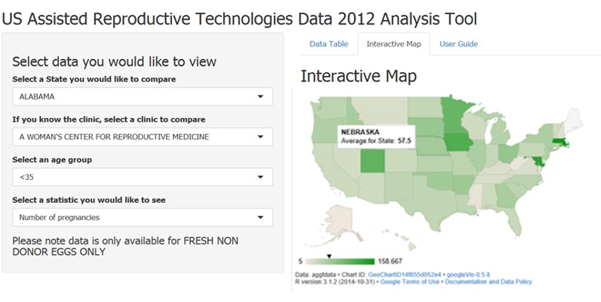
Screen shot of my ARTApp so far
My idea is that someone can select a state they are interested in, it shows all the fertility clinics in that given state, then the user can select a fertility statistic they are interested in comparing their clinic against the state wide average. There is also a map of the states that shows the statistic average for each state. This is just a prototype for now, I will keep working at it and include all data available from CDC, not just data for fresh embryos. Also add in some more interactive charts for looking at ART data over time.
Now, wouldn’t it be good to know what the IUI stats are like too?


Very cool!
LikeLiked by 1 person
😎
LikeLike
Yes! I so wish they had to publish IUI stats.
LikeLike
Great idea, and your app looks lovely!
LikeLike